Why Image Size Kills Your Page Speed
Images are the single heaviest component of most web pages. According to HTTP Archive, images account for 50–80% of total page weight on the average website. A homepage with 2MB of unoptimized images will load noticeably slower than one with 400KB of optimized images — especially on mobile connections where bandwidth is limited and latency is high.
Google has made page speed a direct ranking factor. Slow-loading pages suffer in search results, experience higher bounce rates, and convert fewer visitors into customers. The good news? Image optimization is one of the highest-impact, lowest-effort improvements you can make.
The 3-Step Web Image Optimization Workflow
Professional web developers follow a simple three-step process for every image they publish:
- Resize to display dimensions. Do not upload a 4000×3000 pixel image if it will be displayed at 800×600. Use Image Toolbox to scale images down to their actual rendered size.
- Convert to a modern format. WebP and AVIF deliver the same visual quality as JPG at 25–50% smaller file sizes. For compatibility, provide a JPG fallback using the
<picture>element. - Compress to 60–80% quality. The visual difference between 100% and 70% quality is nearly invisible to most viewers, but the file size difference can be 60% or more.
Implementing Responsive Images with srcset
Modern browsers support the srcset attribute, which lets you serve different image sizes for different screen widths. This ensures mobile users download small images while desktop users get high-resolution versions:
<img src="photo-800.jpg"
     srcset="photo-400.jpg 400w,
             photo-800.jpg 800w,
             photo-1200.jpg 1200w"
     sizes="(max-width: 600px) 400px, 800px"
     alt="A descriptive alt text">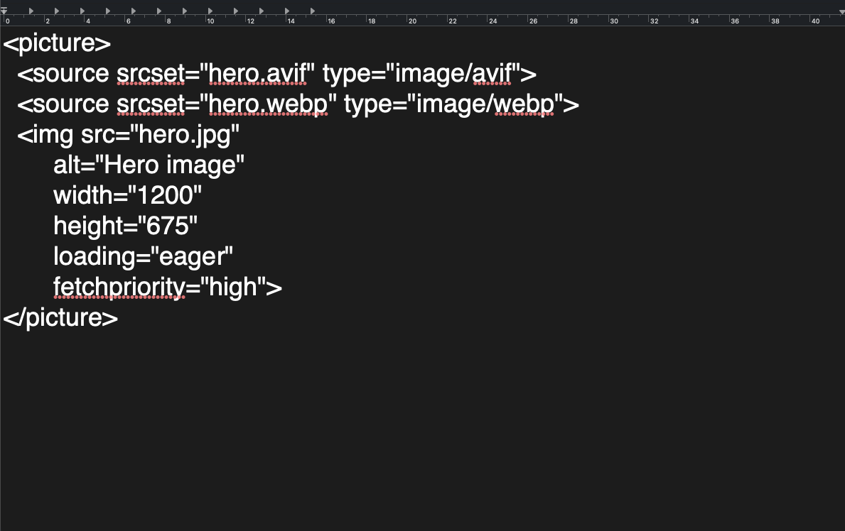
This single technique can reduce mobile data usage by 50% or more without any visible quality loss.
Bulk Optimize Your Images for Free
You don't need expensive software or cloud subscriptions to optimize images. Image Toolbox handles resizing, format conversion, and compression in one place — entirely in your browser. Your images never leave your device, and there's no sign-up required. Combine it with our format converter to modernize your entire image library in minutes.
Frequently Asked Questions
What is the best image format for websites?
WebP is the best all-around choice for most websites in 2026. It offers 25–35% smaller files than JPG, supports transparency, and is supported by 97% of browsers. For maximum compatibility, provide a JPG fallback.
How much does image compression improve page speed?
Properly optimized images can reduce total page weight by 50–80%. On a 2MB page, this could mean saving 1–1.5 seconds of load time — a dramatic improvement for user experience and SEO.
Should I compress images before uploading to WordPress?
Yes. While WordPress does create resized thumbnails, it does not re-compress the original upload. Compressing images beforehand ensures your source files are already optimized, reducing storage and bandwidth usage.
Real Performance Gains
We optimized a sample e-commerce page with 20 product images (total 8.2MB) down to 1.9MB using WebP conversion and lazy loading. The Lighthouse Performance score went from 42 to 89. Largest Contentful Paint improved from 4.2s to 1.8s. The key technique was serving responsive images with srcset — mobile users received 400px-wide versions while desktop users got 1200px.